
Roy Oxlade and Tal R in Hastings
by Martha Barratt
Reviews /
Exhibition
• 11.07.2019
Ten years ago Roy Oxlade described his fellow painter Tal R as ‘one of the best and most promising of today’s artists’, following his solo exhibition at the Camden Arts Centre, London. Four years later, the Jerwood Gallery opened in Hastings – amid well-publicised local protest – with a show of work by Rose Wylie, Oxlade’s partner. Since these respective moments, both Wylie and Tal R have enjoyed immense success, leading the continuing reign of figurative-ish painting in both museums and markets. Oxlade himself was not given a solo museum show in his lifetime (he died in 2014) and there is no work by him in public collections. And yet, throughout his life, Oxlade was a key figure, working away just behind the public face of painting as a devoted writer and teacher, as well as on his energetic, self-assured but light-hearted canvases.
This elision is addressed by the exhibition Roy Oxlade: Shine Out Fair Sun, which joins Tal R: Eventually All Museums Will Be Ships to inaugurate Hastings Contemporary. Previously known as the Jerwood Gallery, the space was rebranded this month after the Jerwood Foundation and the gallery decided to split, the Foundation taking its significant financial contribution, and its collection of Modern British art with it. Apart from filling the funding gap – despite a £100k commitment from the Arts Council, the gallery will need to raise more than £200k per year from private sources and the borough council to make up the shortfall – the challenge facing the Director, Liz Gilmore, is to create an institution with a defined purpose and identity, that holds its own as a regional centre for contemporary art.1
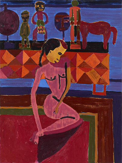
The first and largest gallery is given a colourful Salon hang by Tal R, of works from throughout his career: African sculpture pushes into Matisse-esque still lifes FIG.1, while other pieces are more abstract, as in a series of pudgy concentric pink lines, like a child’s doodle blown up to the size of a poster. Tal R explains that he wants people to access his painting through banality – by recognising a familiar form, noting the simple lines or colour– but leave with something deeper. His image of a house, for example, is seen head-on, framed by picket fence and power lines, painted in bold, flat colours and simple lines. Again, it recalls the compositions of children. And yet the fence cast in shadow also suggests something mystical, such as a haunting. Many of the paintings share this atmospheric quality: the simple or nostalgic forms, often subtly inverted, encourage personal associations. But in others, the juvenile nature of the line and colour, can feel more standoffish, a macho assertion of the plainness of the painting as a reflection of the artist’s interests or desires: ‘if I want to paint a house, I will paint a house’. Banality may be the way in, but in certain works, it never quite leaves.
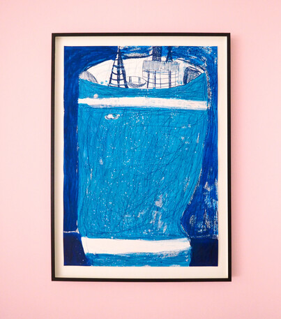
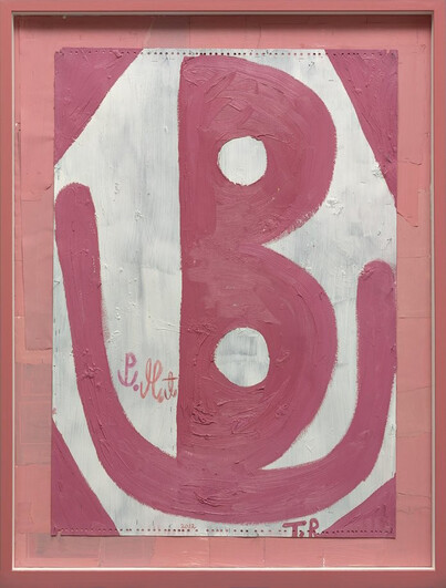
In the same room, low plinths in primary colours display framed pencil drawings, arranged like tiles, of Tal R’s voyage to Malia in Denmark, during which he concentrated on recording directly from nature, a contrast to the mostly imagined compositions on the walls. More pictures from this trip fill a second room. Between them is a pink corridor along which are hung oilstick drawings of blue ships FIG.2. The group began with R’s conceit of a boat that is New York, towering and tottering high above the ocean, city towers among the chimneys protruding from its hull. These more illustrative works are accessible and playful, the display of multiple images from a body of work providing the sense of narrative that is missing from the pick-and-mix selection from across the artist’s career jostling in the first room. In the final space, the Malia pictures are bright abstractions of natural phenomena – trees, mountains, clouds reflected in a lake. One stands out in shades of pink: a letter B – or perhaps it is a pair of cartoonish breasts on their side – is cupped by a U-shaped cradle, held within its own chamber FIG.3. Whether the curly script is a self-conscious reference to the letterforms used by the spiritualist painter Hilma Af Klint is impossible to guess. Also unclear is whether the ‘PMT’ scrawled into the belly of this rather ovarian work (Pre-Menstrual Tension?) refers to anything other than the Danish town for which, Tal R explains, it stands as an abbreviation.
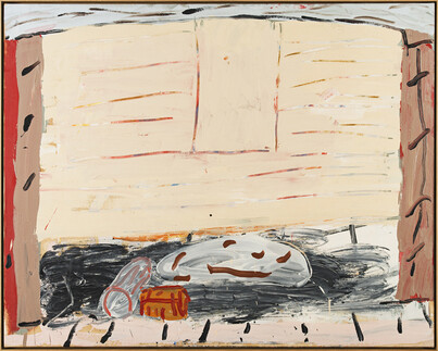
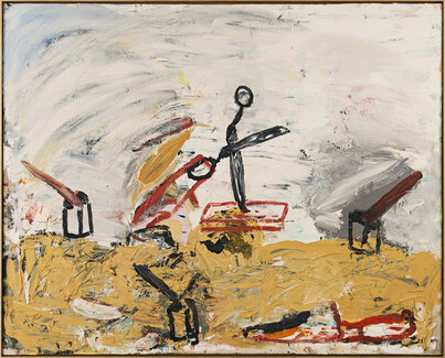
Oxlade’s pictures, which occupy the final lower gallery and the upper galleries, are immediately captivating. Some are reminiscent of Philip Guston, pink and grey canvases bristling with energy FIG.4. Saucepans quiver and scissors fly across space FIG.5. Others are stranger, nude figures floating on painterly planes that reject the illusionistic rendering of space. One of the highlights is a selection of drawings, unearthed, apparently, from drawers in the cottage Oxlade shared for so many years with Wylie. There is a little study of a cafetière that is a celebration of their everyday, of clutter on the kitchen table, toast crusts and paintbrushes in jam jars. Some of the drawings use colour like auras, halos of pink behind and around shapes, not confined to the objects’ edges. Colour is used in a similar fashion in a painting of a foldable round table, which is bordered with other-worldly swathes of pink and yellow. One of the most striking pictures is of a sink on unprimed canvas. Its lines sweep cleanly along the curves of the cistern, an elegant graphic quality that verges on the decorative and that would be at home alongside the work of much younger artists.
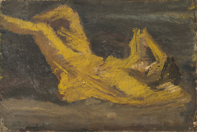
There is little sign of this future confidence in the earliest work on view, an angular reclining nude Oxlade painted when he was taking evening classes with David Bomberg in the early 1950s FIG.6. Work by Bomberg is hung alongside his student’s, providing the link between the Jerwood’s collection of Modern British art that used to hang in the space, and contemporary painting. It is a thoughtful way of marking the institution’s revised focus, and touching to see the teaching connection – both artists were extremely influential on younger artists, a legacy that might match their individual achievements as producers of paintings. The pictures on view by Bomberg are mostly spiky cityscapes in dark, brooding hues. It is these aspects that Oxlade took for his early figure, painted in a dingy palette of browns and ochres, angular and androgynous. There are shards of paint which hint at breasts, although one appears to be sliding into the figure’s armpit, and the bottom protrudes from the leg like a carbuncle, almost at a right angle.
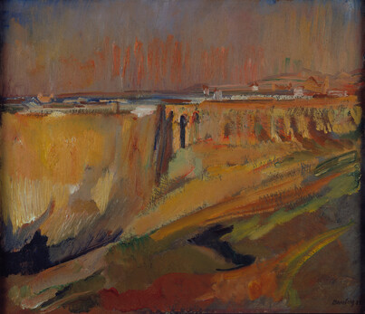
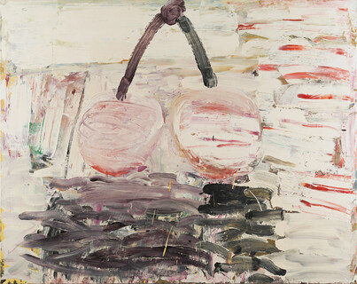
The real influence of Bomberg, it seems, came later in Oxlade’s career. Oxlade studied his work in greatest depth not as a painting student, but while researching for his PhD, ‘Bomberg and the Borough: An Approach to Drawing’, completed in 1976, twenty years after his teacher’s death. And it is in his paintings in the late 1970s and 1980s that the influence is most clear, not in any sylistic sense, but in his handling of paint. In Bomberg’s The old city and the cathedral, Ronda FIG.7, for instance, paint is applied in flat layers, perhaps with a palette knife rather than a brush; colours are not so much mixed but dragged across and into one another. Oxlade’s large canvas Two Cherries (1981) FIG.8, meanwhile, is an ice-cream coloured confection, an abstract, heavily textured ground on which is centred a pair of almost bawdily juicy cherries. It is larger than most things his master painted, and bears little resemblance to Bomberg’s own, very careful, still lifes. But when you look closely, the paint – albeit in marshmallow-pink – behaves similarly. Colour is dragged across wet. Paint is applied generously, but rarely impasto, so that the direction in which it is applied creates a surface pattern – a sort of loose Cubist passage that characterises both Bomberg’s cool abstractions and Oxlade’s ebullient cherries.
Although he occupies this most traditional lineage of British painting, Oxlade turns out to be a brilliant choice for the inauguration of Hasting’s new-old contemporary space. Like the art of any period, contemporary art exists in many forms, and it needs a variety of spaces. The gallery’s light-filled building, with plenty of wall space and modest-scale rooms, is ideal for showing painting, but would likely prove challenging for the large-scale new media shows staged so successfully by its regional counterparts, such as Nottingham Contemporary or the nearby De La Warr Pavilion in Bexhill-on-Sea. With the departure of the Jerwood’s collection, it is hoped that Hastings Contemporary will retain something of its legacy, as a place to look at paintings.